I remember standing in the middle of my first tiny commercial kitchen, surrounded by half-empty paint cans and a mounting sense of panic. I had spent years analyzing spreadsheets where everything was black and white, but suddenly, I was staring at a wall of “eggshell” and “cream” swatches, realizing that knowing how to choose a color scheme wasn’t as simple as balancing a budget. I felt like I was failing a test I hadn’t even studied for, paralyzed by the fear that one wrong shade of sage would ruin the entire vibe of my dream business.
I’m not here to give you a lecture on complex color theory or tell you that you need a professional designer to make your space livable. Instead, I want to share the practical, no-nonsense framework I used to bridge the gap between my analytical brain and my creative soul. We’re going to dive into a way to pick palettes that feel as intentional and nourishing as a perfectly seasoned reduction, ensuring your space reflects your passion without breaking your bank account.
Table of Contents
- Mastering Color Theory for Beginners and Your Soul
- Warm vs Cool Color Tones for Emotional Balance
- My Recipe for a Balanced Palette: 5 Tips to Find Your Perfect Mix
- Bringing It All Together: My Color Strategy for a Balanced Life
- Finding Your Visual Flavor
- Finding Your Perfect Palette
- Frequently Asked Questions
Mastering Color Theory for Beginners and Your Soul
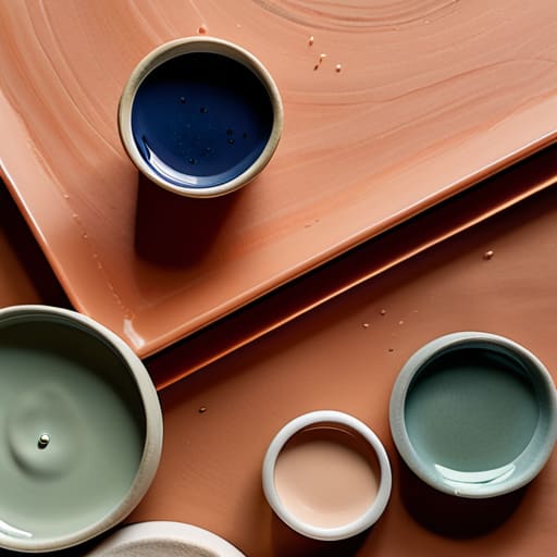
When I first started diving into the world of aesthetics, I realized that color isn’t just about what looks “pretty” on a Pinterest board; it’s about how a space makes you feel. Think of it like seasoning a dish—you wouldn’t dump a whole jar of salt into a delicate consommé, right? Understanding color theory for beginners is much the same. It’s about finding that equilibrium between visual stimulation and emotional comfort. Whether you’re leaning into the high energy of complementary color combinations or seeking the calm of a monochromatic set, you’re essentially setting the emotional “flavor profile” for your home.
To keep things from feeling chaotic, I always recommend a bit of structural discipline, much like a well-balanced budget. A professional secret I swear by is using the 60-30-10 rule: 60% of your space in a dominant color, 30% in a secondary shade, and 10% in a bold accent. This creates a sense of order that prevents your eyes from darting around too much. It’s all about creating a sense of harmony that allows you to breathe, work, and—most importantly—enjoy your meals in a space that truly nourishes your soul.
Warm vs Cool Color Tones for Emotional Balance
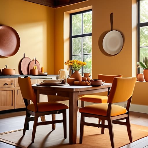
When I first transitioned from the high-stakes, gray-toned world of financial analysis to my own kitchen studio, I realized just how much temperature impacts my headspace. In the world of interior design color psychology, choosing between warm and cool tones isn’t just an aesthetic choice; it’s an emotional one. Warm tones—think sunset oranges, buttery yellows, and earthy terracottas—act like a cozy hug, making a space feel social and energetic. I love using these in a dining area to encourage long, lingering conversations over a great meal.
On the flip side, cool tones like sage greens, soft blues, and crisp lavenders offer a sense of serenity and focus. If you’re designing a home office or a quiet reading nook, these shades can help lower your heart rate after a hectic day. The real magic happens when you master warm vs cool color tones to create balance. You don’t have to pick a side! I often find that layering a few warm wood accents into a cool-toned room prevents it from feeling too clinical, ensuring your space feels as nourishing and soulful as a home-cooked meal.
My Recipe for a Balanced Palette: 5 Tips to Find Your Perfect Mix
- Start with your “hero” ingredient. Just like a signature dish relies on one star component, pick one color you absolutely love to be your anchor. Whether it’s a deep sage green or a vibrant saffron, let that be the foundation that everything else revolves around.
- Use the 60-30-10 rule to keep things from feeling chaotic. In my finance days, we loved a good ratio, and this one is no different: 60% of your space should be a dominant neutral, 30% a secondary color, and 10% a bold accent. It prevents your eyes (and your budget!) from getting overwhelmed.
- Don’t fear the “seasoning.” If a room feels a bit flat, it’s usually missing a pop of contrast. Think of it like adding a pinch of sea salt to caramel—a small amount of a contrasting color can suddenly make the whole scheme sing and feel much more intentional.
- Test your colors in different “lighting conditions.” A color that looks like a dream in the bright morning sun might turn moody and dark once the evening lamps are on. Before you commit, swatch a few options to see how they transform as the day progresses.
- Let your personal history guide you. I often find inspiration in my vintage cookbooks—the faded ochres and dusty blues of old covers tell a story. Don’t just follow trends; choose colors that evoke a memory or a feeling that makes your space feel like you.
Bringing It All Together: My Color Strategy for a Balanced Life
Treat your color palette like a well-balanced recipe; just as you wouldn’t dump a whole jar of salt into a delicate broth, don’t overwhelm your space with too many loud hues—aim for a mix of “seasoning” colors and stable, neutral “base” tones.
Don’t let the fear of a “bad” investment stop you from experimenting; whether it’s a bold accent wall or a new kitchen aesthetic, the most important thing is that the color choice aligns with your personal brand and fuels your creative energy.
Use color as a tool for emotional ROI (Return on Investment); choose tones that don’t just look pretty on a mood board, but actually pay dividends in how you feel—whether that’s the calm of a cool blue after a hectic trading day or the warmth of a sunset orange during a cozy dinner party.
Finding Your Visual Flavor
Choosing a color scheme is a lot like balancing a complex recipe; you don’t just throw ingredients together for the sake of it, you layer them to create a mood that feels as intentional and nourishing as a perfectly seasoned meal.
Rachel Anderson
Finding Your Perfect Palette
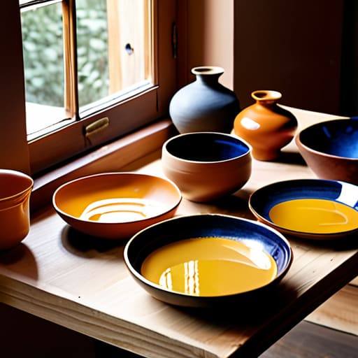
As we wrap up our deep dive into the world of color, I hope you feel a little more confident stepping away from the safety of neutral beige and into a world of intentional design. We’ve explored how mastering color theory isn’t just about following a textbook, but about understanding how hues interact to create a sense of harmony. We also looked at how balancing warm and cool tones can shift the entire energy of a room—turning a sterile space into a sanctuary or a workspace into a high-energy hub. Remember, choosing a color scheme is a lot like perfecting a complex fusion recipe; you need to understand your base ingredients before you start adding those bold, spicy accents that make the whole thing pop. Trust your intuition as much as you trust the color wheel.
Ultimately, whether you are redesigning your kitchen to spark culinary creativity or simply refreshing your home office, don’t let the fear of making a “wrong” choice paralyze you. In my transition from the structured world of finance to the unpredictable life of an entrepreneur, I learned that the most beautiful outcomes often come from a bit of calculated experimentation. Your home should be a reflection of your evolving journey, a place that nourishes your soul just as much as a well-cooked meal nourishes your body. So, grab some swatches, play with the light, and embrace the process of creating a space that truly feels like you.
Frequently Asked Questions
How do I pick a color palette that reflects my personal brand without feeling too overwhelming or cliché?
Think of your brand palette like a signature fusion dish: you want a few bold, standout ingredients, but you don’t want them fighting for attention on the plate. Start by picking one “hero” color that mirrors your core energy—maybe a grounded forest green or a high-energy saffron—and then layer in two neutrals to let it breathe. This prevents that “visual clutter” feeling and keeps your brand feeling intentional, not overwhelming.
Can you help me balance my budget when trying to implement a new color scheme in my kitchen or workspace?
Budgeting for a makeover can feel as daunting as a volatile stock market, but don’t let it stall your creativity! I always recommend the “High-Low” strategy: invest your capital in high-impact, durable items like a statement backsplash or a premium ergonomic chair, then save on the small stuff. Grab thrifted vintage canisters or budget-friendly paint for accent walls. It’s all about strategic allocation—prioritizing where the visual “flavor” matters most without breaking your bank.
Is there a way to use color to boost productivity during my workday while still keeping my environment feeling cozy and inviting?
Think of your workspace like a well-balanced recipe—you need both the zest of productivity and the warmth of comfort. I love using “muted energizers.” Instead of a jarring, bright red that feels like a high-stress trading floor, try a soft terracotta or a sage green. These tones provide a gentle mental lift to keep you focused, but they retain that soulful, cozy vibe that makes your home office feel like a sanctuary rather than a cubicle.